TAGS
Branding
Handcrafted
Packaging
Handcrafted
Packaging
DELIVERABLES
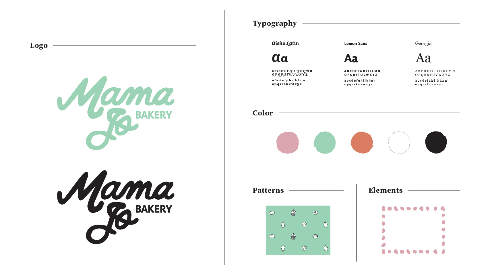
Logo
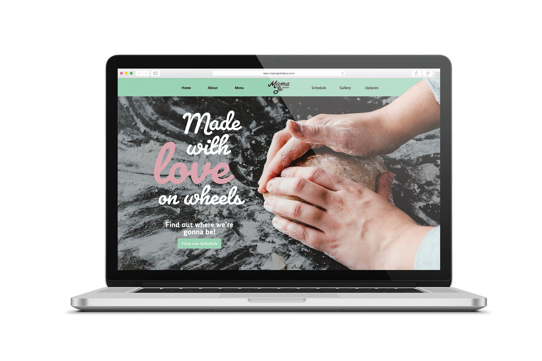
Website
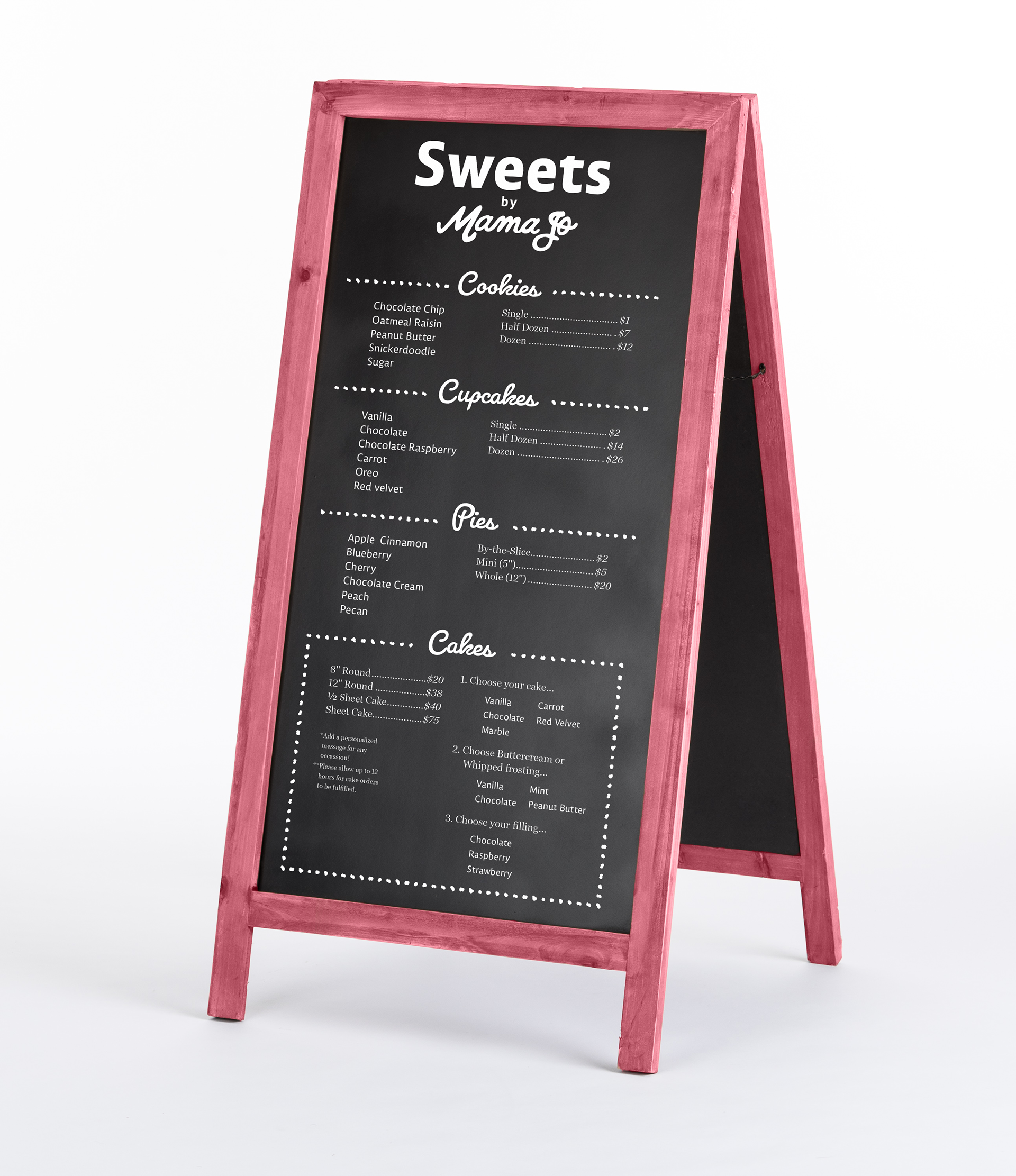
Menu
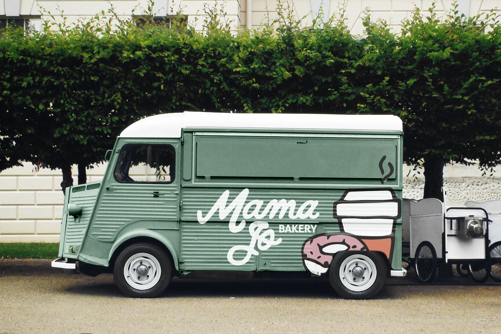
Truck
Hand Stamp
Business Cards
Website
Menu
Truck
Hand Stamp
Business Cards
OVERVIEW
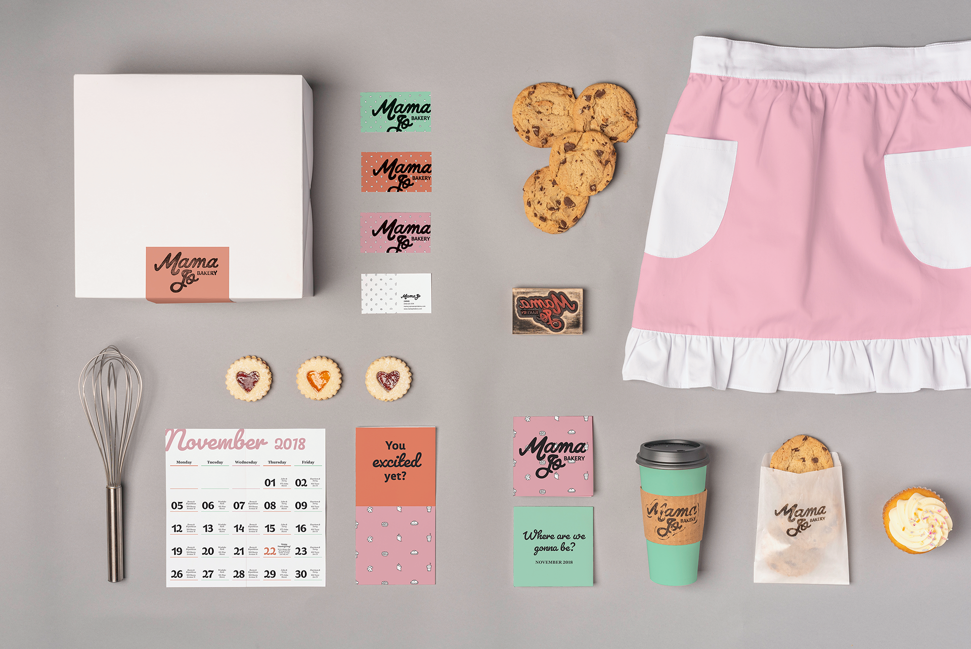
Mama Jo bakery is a small mom-and-pop bakery on wheels based in Seattle, Washington. Fighting the cold city stigma, Mama Jo caters to young adults ages 21-40 and young families, where people can get real, hometown treatment with a side of cookie. The brand has an uncluttered aesthetic, but it was vital to keep it human, fun, and approachable.
APPROACH
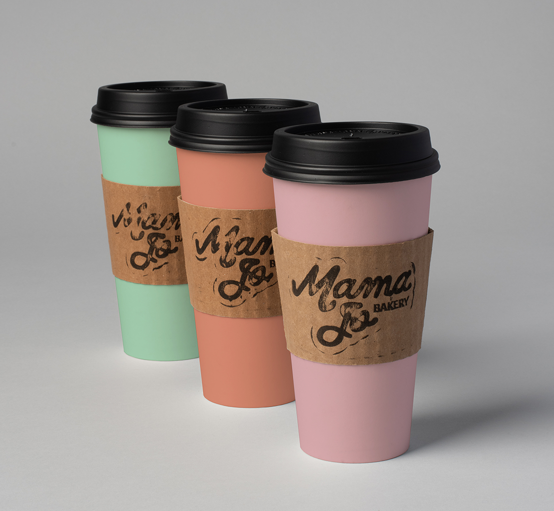
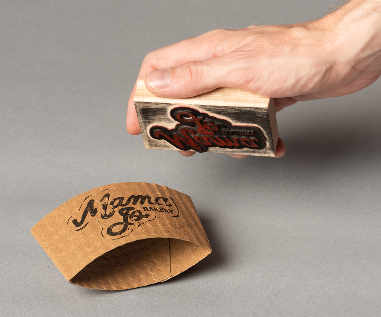
Keeping with the homemade spirit of Mama Jo, I chose the handwritten font Pacifico, paired with Lemon Sans, a soft and approachable sans, for the logo. I carried the idea of crumbs throughout the brand because of their organic forms and unique imperfections, an aesthetic I also applied to the pattern illustrations. As Mama Jo bakery is a small company, I designed a logo stamp that can be applied to various standard packaging forms, keeping costs down.