TAGS
Branding
Collateral
Multi-page Document
Website Design
Collateral
Multi-page Document
Website Design
DELIVERABLES
Logo
Website
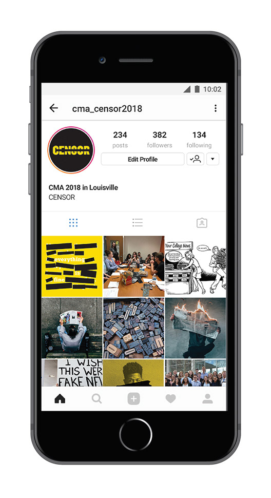
Social Media
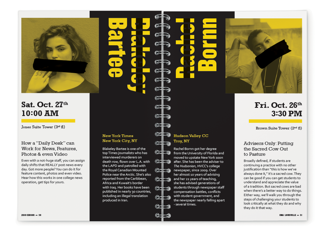
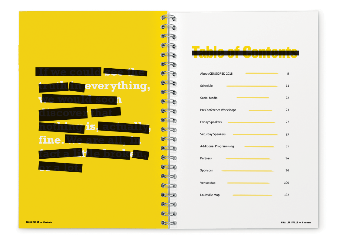
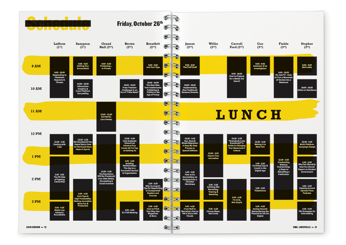
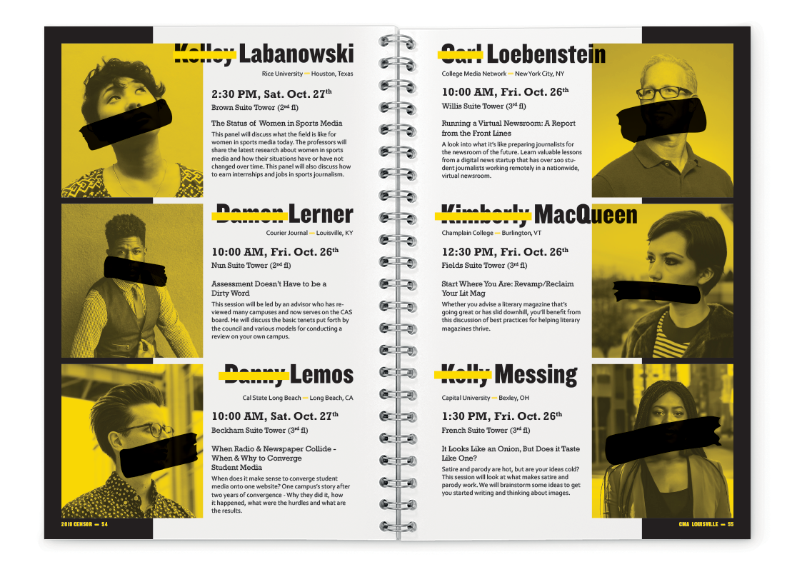
Conference Manual
Badges
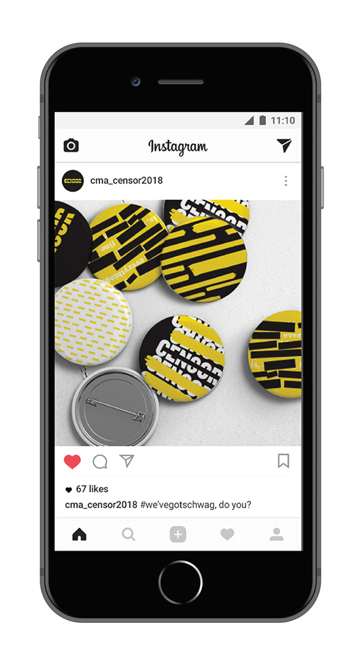
Schwag Items
Website
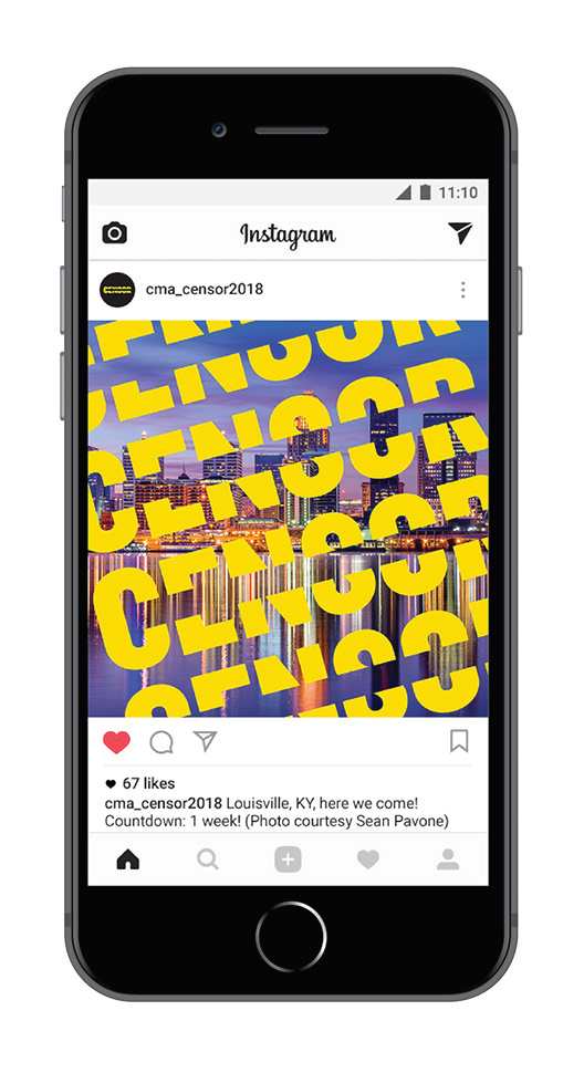
Social Media
Conference Manual
Badges
Schwag Items
OVERVIEW
The annual College Media Association (CMA) conference focuses on providing educational opportunities for college media staff and their advisers. In years past, the conference has always been an event that seeks to both engage students in a fun way and prepare them for professional careers.
APPROACH
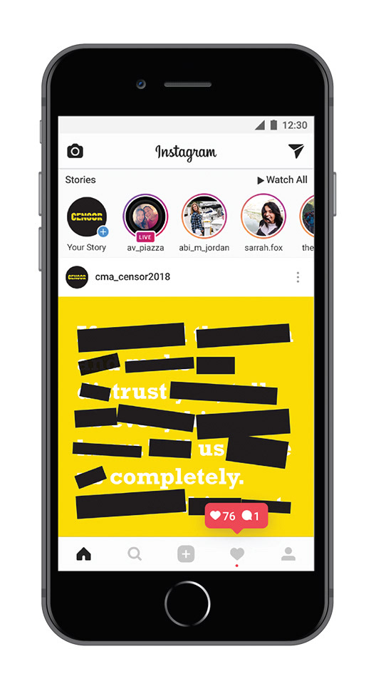
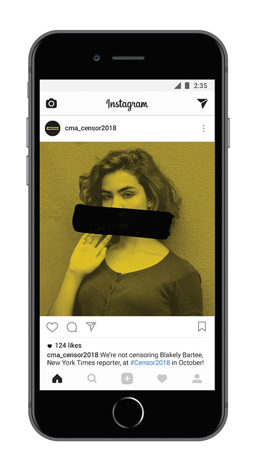
I chose the “Censor” theme to bring a fresh face to the 2018 CMA Conference that was relevant to the media climate in America today. Wanting to steer away from the reds traditionally used to represent censorship, I chose caution-sign yellow and paired it with traditional black-and-white. I decided on Knockout for the logotype, favoring its heavy stroke. In the speaker name treatments, logo, and photos, I used crossing-out to represent the censorship theme. The website homepage carries the same motif, as I used redacted text that hints at another message being obscured.
