TAGS
Website Design
DELIVERABLES
Logo
Website
Website
OVERVIEW
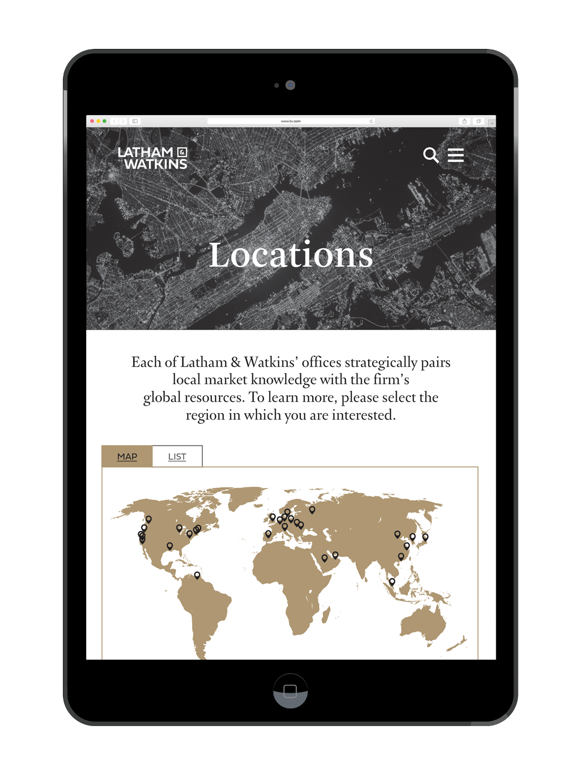
Latham & Watkins LLP is a well-respected law firm that ranks in the top five grossing firms in the world. They employ over 2,700 lawyers in over 14 locations across the globe, but their website requires an update as it fails to represent their professionalism and is hard-to-navigate.
APPROACH
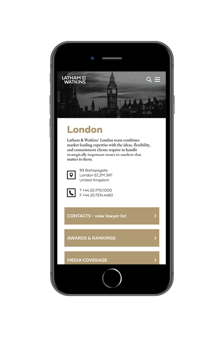
Cleaning up Latham & Watkins' website was the top priority for me, but their identity and logo begged for an update as well. I chose Fieldwork for the logotype and kept it simple, creating a lockup that looked beautiful both stacked and written straight. To create unity across their extensive site, I selected a muted yellow that hints at gold when paired with the monochromatic photos, though I used the color sparingly. I also introduced a more comprehensive user flow and several site interactions such as hover-states and moving parts.
