TAGS
Branding
Cross-cultural
Packaging
Cross-cultural
Packaging
DELIVERABLES
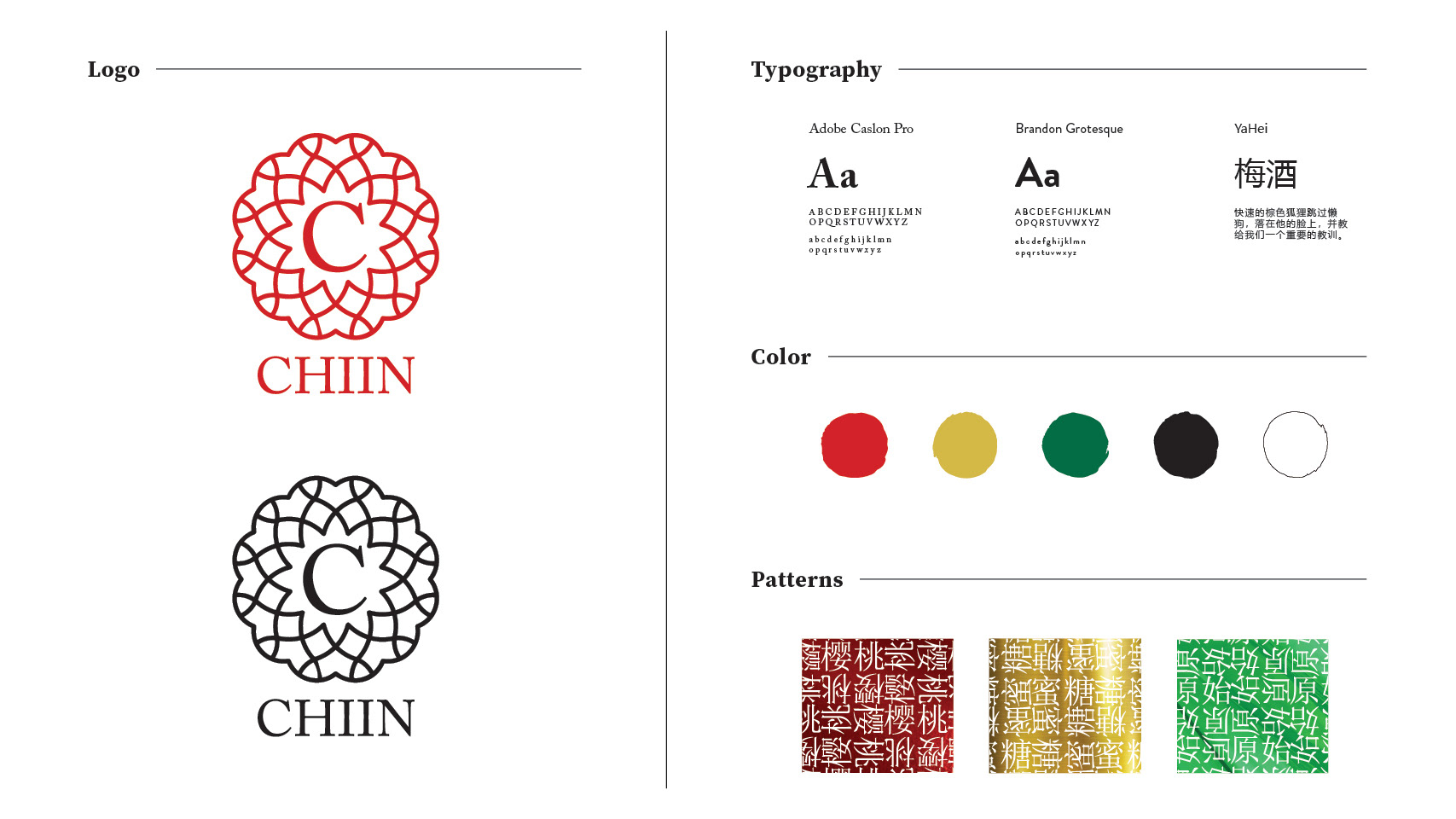
Logo
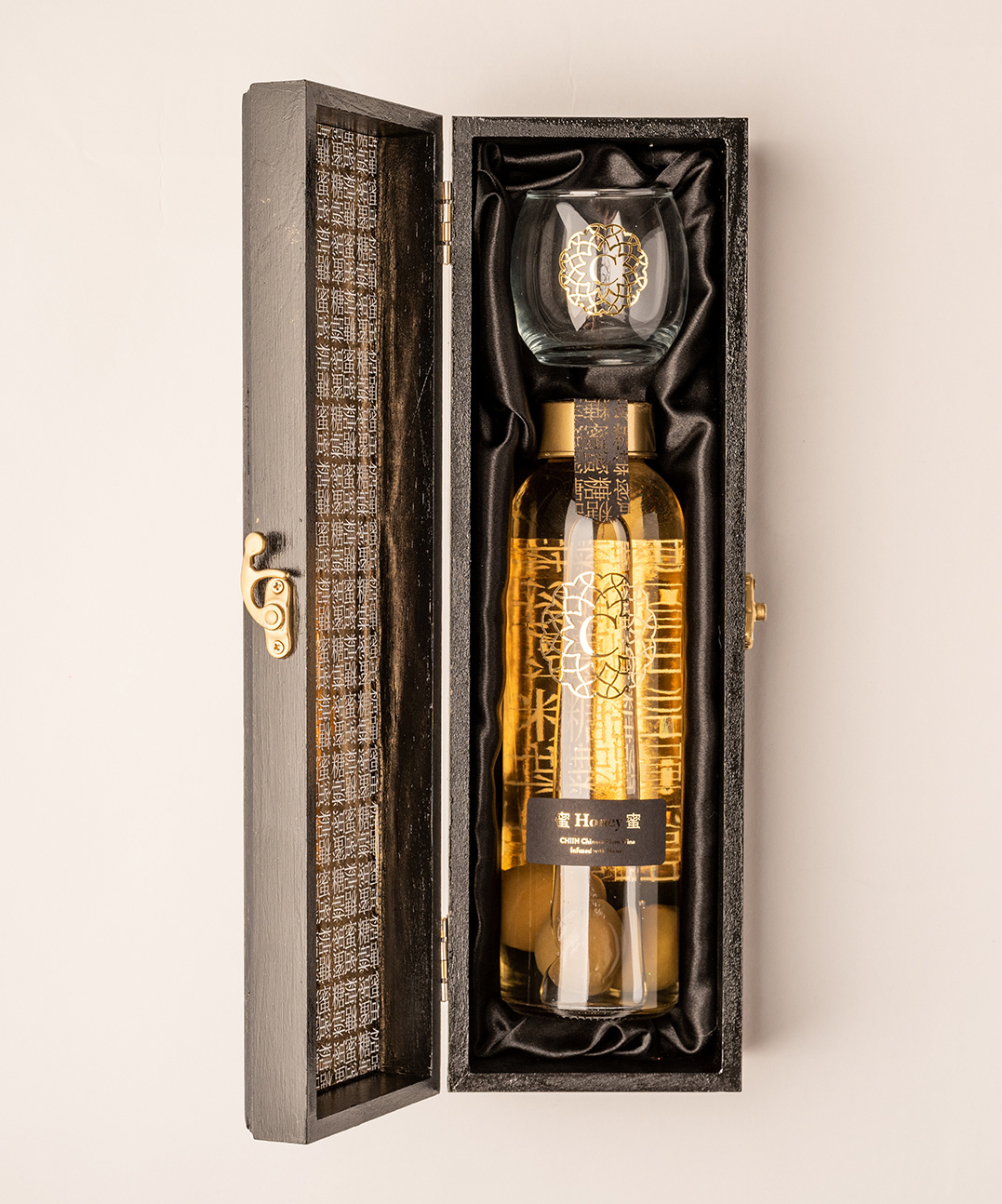
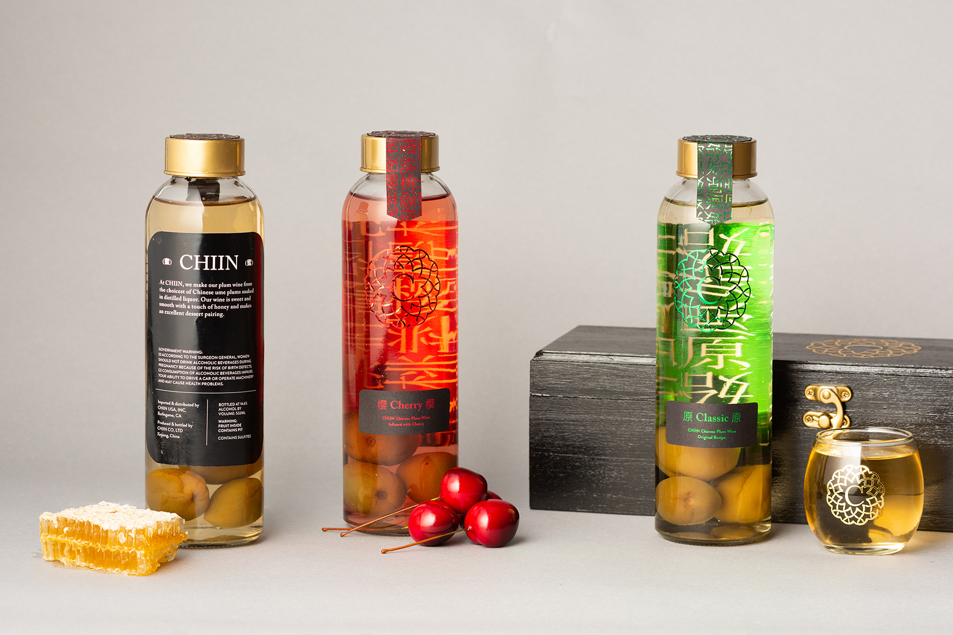
Bottles
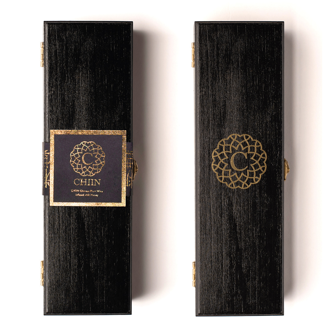
Gift Box
Patterns
Bottles
Gift Box
Patterns
OVERVIEW
Though Chinese plum wine has been made in homes for centuries, it is virtually unknown in the United States. High-end plum wine is even harder to find in the U.S., and Chiin seeks to fill that market. Targeted towards affluent buyers ages 30-50, the brand seeks to foster friendship and community, as the name itself means “a very good friend.”
APPROACH
In an attempt to bring this Asian wine to Western markets, I blended elements from the two cultures in the bottle design. I intertwined Chinese characters for the flavors into patterns that can be seen on the reverse side of the back label through the wine itself. The logo is a simple crest with the Chiin “C” in the center. I used the stately serif Caslon paired with friendly sans Brandon Grotesque to convey both the elegance and approachability of this brand. I chose foil in different colors to differentiate the flavors and contribute to the premium feel. The bottle form was chosen over a typical wine bottle for its wide mouth to allow easy access to the plums inside.