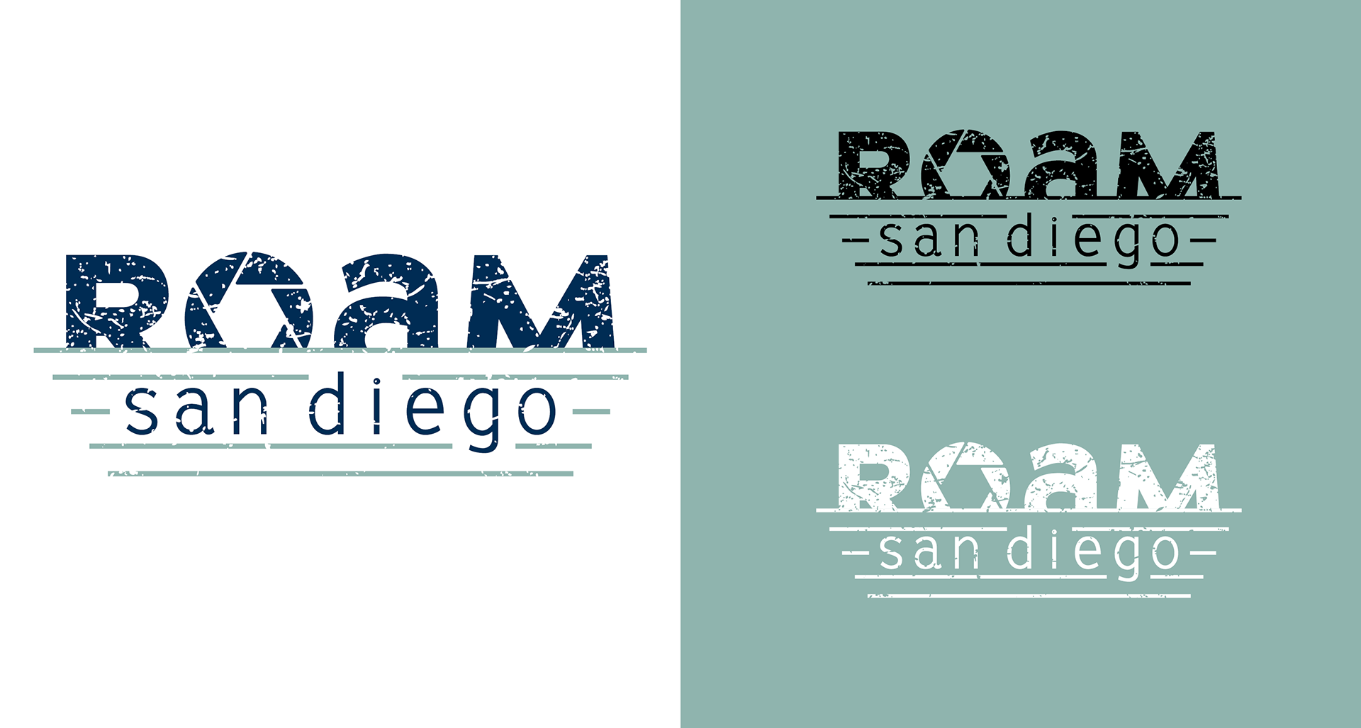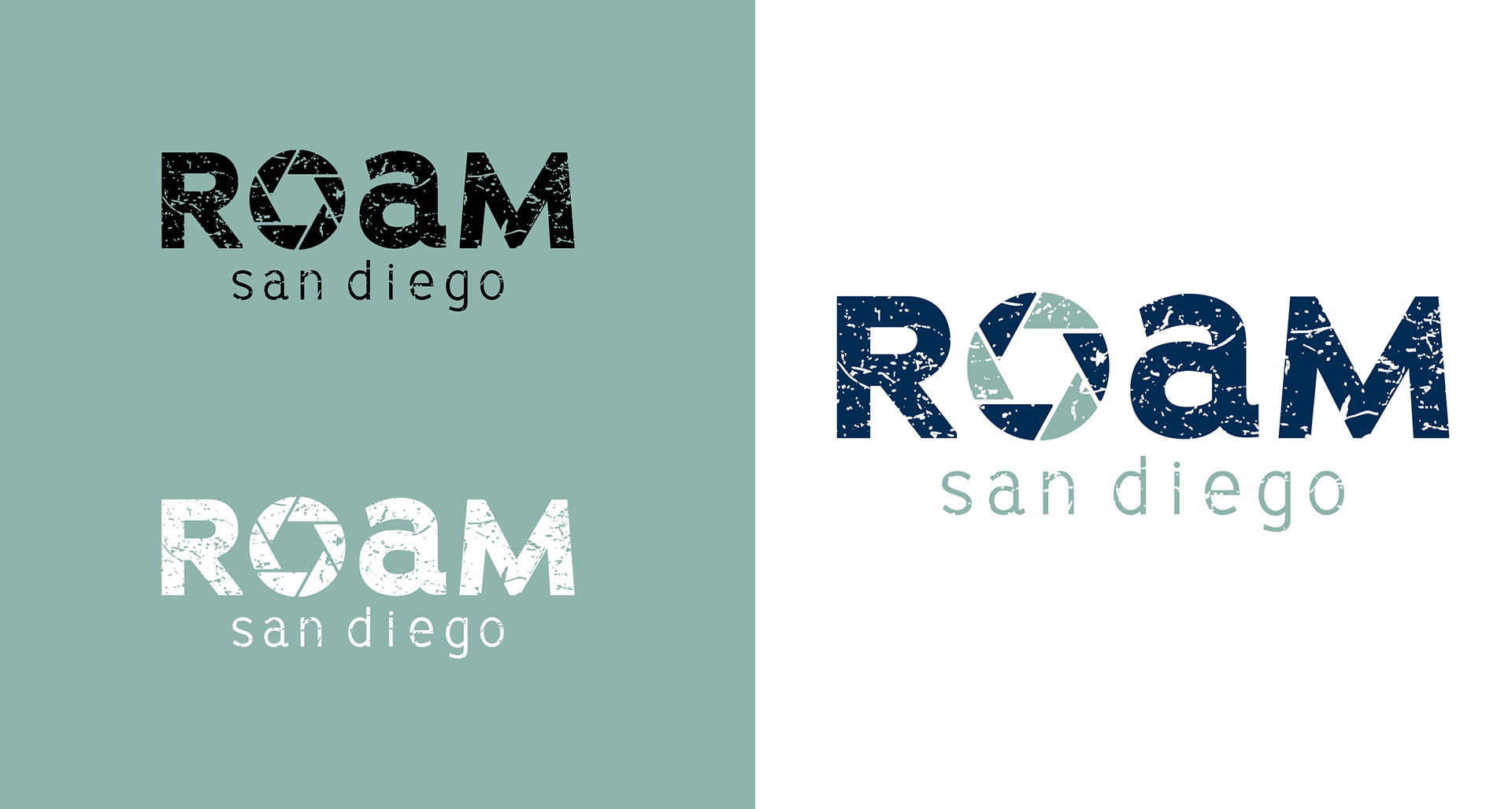
OVERVIEW
Roam San Diego is an adventure vlog that shares hidden gems of the San Diego landscape with its viewers to really capture the city’s culture. They wanted a simple mark that was natural and organic, didn’t use any loud colors, and reflected the idea of “going wherever the road may take you.” The logo had to work on a digital medium because it would primarily be used for the vlog’s YouTube and Instagram platforms, though there was a possibility the logo would be printed on promotional items such as t-shirts and stickers in the future.
APPROACH
To really capture the character of the city for which the vlog is named, I cut the bottom quarter of “ROAM” off and added horizonal lines underneath, giving it a setting-sun-over-the-horizon motif. I also replaced the “O” with a camera aperture to symbolize the recordings and photos Roam San Diego takes around the city. I was drawn to the unicase forms of BigSmalls because they added another layer of individuality, and I paired all caps with all lowercase of the same font for hierarchy purposes. I settled on seafoam green paired with navy blue for the color palette to further enforce the setting sun motif and, for the final touch, applied a worn texture to give the logo even more of an organic charm.