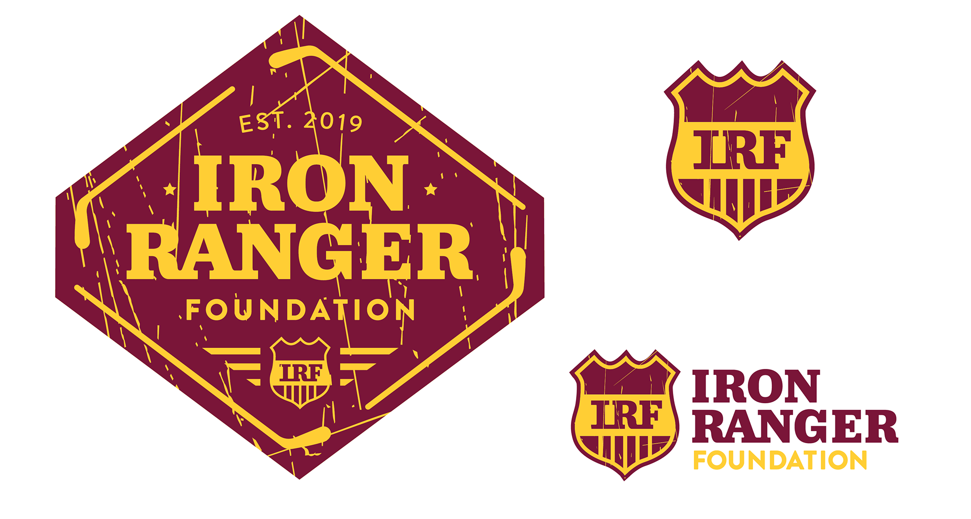
OVERVIEW
The Iron Ranger Foundation is a newly-formed scholarship foundation that focuses on providing access to higher education for high school students who have shown resiliency in overcoming the challenge of losing a parent. They wanted a bold, gritty mark that reflected the strength of the students they aim to help; the logo also had to include an element of hockey to pay tribute to the foundation’s origins.
APPROACH
I created system of logos with varying complexities that would work at different sizes, including a linear design and a main crest that incorporated a shield element that could be used on its own. I thought that using an overt hockey reference might confuse the viewer, so I worked to minimize its impact as much as I could by using hockey sticks as a border instead of a solo element. I also applied a texture reminiscent of skate marks on an ice rink to further that goal and give the mark a grungy charm. Jubilat was my typeface of choice because of its sturdy yet inviting form, and I complimented it with the friendly sanserif, Brandon Grotesque.